The easiest way to move between cells in a table is to use the mouse to click on the cell you want. Pressing the tab key will jump the cursor to the next cell, left to right, as is the English reader’s habit. Hold down shift to tab backwards.
Selecting Cells
To select a single cell, triple-click on its contents using the mouse.
Keeping your hands on the keys is often a faster option:
Place the cursor at the start of the text you want to select.
Hold shift while you arrow to the end of your selection.
Selecting Whole Rows or Columns
Using the mouse
Hover the pointer just outside the edge of the table either above the column you want to select or to the left of the desired row. When the pointer turns into an arrow, click the mouse.
To select more rows/columns, keep holding down the mouse button while you drag the pointer across them. Just release the mouse to finish selecting.
Using the ribbon
Click somewhere in the desired row or column. Then on the Layout ribbon, click the Select icon at the far left, then choose from the options.
Troubleshooting
It is possible to select a row by dragging the cursor from one edge to the other. But if you don’t select the marker at the end of the row, it selects only the cells, not the whole row.
Some of the things that make tables messy are heads that don’t span what they should, misaligned columns, data that doesn’t align, and headers that should repeat on each page. Let’s start with the first issue: getting the spanning heads right. (Check out the demo video at the end, too.)
Create spanning heads
Making a header that stretches over several columns takes just two clicks:
Click and drag over the cells you want to turn into the spanning head, then
right-click on the selection, and choose “merge cells” from the context menu that pops up.
Alternatively to step 2, you may select the Merge Cells icon on the [table] Layout ribbon shown below.
When the cursor is placed within a table, a second Layout ribbon appears. That is where you find the Merge set of icons. (Mac shown here, Windows shown below.)The Windows version has nearly identical Layout ribbon.
Word will combine all the contents of the selected cells into a single cell that spans the selected columns. It’s especially handy that all the contents are combined in cases where the writer tried to fake a spanning header. Just remember to delete the extra line breaks this merging of content creates.
Remove spanning heads
If instead, you need to make a head span fewer columns, you can select the Split Cells icon on the [table] Layout ribbon. Word then asks how many columns to split it into; enter the number of columns right and column edges should line up automatically. Next week we’ll look at how to clean them up if they don’t align.
The contents of the spanning head can be styled as you would other table contents.
Troubleshooting
Sometimes the changes that were made to a table leave all kinds of background code that make a mess of what you’re trying to clean up. Sometimes, adding a row and starting fresh is easier than fixing all the errors. Occasionally, it’s easier to create a whole new table and do it right the first time.
You may want to turn off Track Changes while you format the table as all the tracking can obscure important changes made to table contents that you want to be sure the authors do vet. A comment could be left summarizing the formatting changes if the authors are concerned.
How do you know if text is in a table? In the first post in this series, we saw that tab marks and multiple spaces can help you spot text that has been “typewritered” into a table. Gridlines are a dead giveaway that you’re looking at a table, but what if there are no gridlines? How can you tell then?
Click “view gridlines.”
Look for cell end characters.
Look for the Layout ribbon.
These are all really quick checks. Here’s how to do each one.
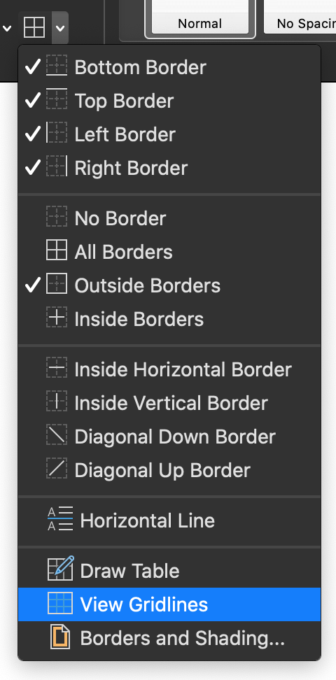
View Gridlines
Place the cursor in the suspect text.
On the Home ribbon, click the Borders icon in the Paragraph group to open the drop-down menu of options (shown at right).
Click on View Gridlines.
If the light-grey borders appear, revealing a table, you win!
Cell End Characters
cell end character
On the Home ribbon, click the Show/Hide ¶ icon, or press the shortcut: Mac: cmd + 8 Windows: ctrl + *
Look for cell end characters at the end of what would be cells. They look like a blue circle with blue lines radiating out from the “corners.” (shown here)
Layout Ribbon
Place the cursor in the suspect text.
Look at the ribbon for a tab called Layout. If that has appeared, it’s probably a table. 99.9% certain.
Demo Video
See these tips in action!
Troubleshooting
Text may be in a text box rather than a table. If this is the case, you can see the border of the box when you click on the text, or when you right-click on the text, the context menu that pops open will contain the option to Edit Text.
Organizing data into
tables is one of the best practices in clear communication according to several
pervasive style guides and according to plain language principles. Word can
make tables easy to work with, even if your author has treated the screen like
a typewriter and kludged a table together with tab marks and spaces.
Converting Text to Tables
If tabs and multiple spaces have been used to create a table, one of the kindest things an editor can do for a production department is convert that mess into a true table. If the stars align, that task can be as simple as this:
Select the
whole mess, then
click the Table
icon on the Insert ribbon and
select Insert
Table from the options.
Word will
automagically convert the tab marks into table cells populated with the content
you selected. It will likely be necessary to clean up the cells after this
conversion to eliminate multiple space marks used to create manual indenting,
etc. But it saves a lot of clicking and dragging!
Be sure to proofread your change to make sure that contents ended up in the correct cells.
Troubleshooting
Do save a reference
copy of the table before you try these tricks. You will probably need it to
check that the content remains arranged as intended.
If the manual table
created multi-line cells with a combination of tab marks and spaces, the conversion
will not be clean. You’ll still have to drag contents into their correct cells
and delete superfluous non-printing marks.
Blank cells can also wreak havoc on alignment and order. Sometimes, it is just less work to create the table with brute force, dragging each cell’s contents into place one at a time. This is a great task to subcontract out if there are a lot of such tables.
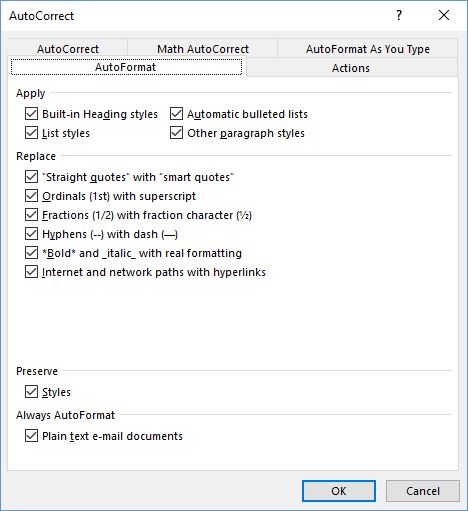
Type 1/2 in a Word document and Word with automatically change that to stacked fraction, if you haven’t changed the default autocorrect settings. But type 2/3, and nothing happens. How can you get all fractions to match? It can take some expert typesetting.
In Word’s Preferences (Mac) or Options > Proofing from the File ribbon (Windows), go to the AutoFormat tab to set whether or not fractions will be replaced with a character when one exists in that font family.
The problem is that not all fonts contain a full range of fractions, so you might not be able to insert even a common fraction like two-thirds. The character viewer in the operating system and in Word’s “insert symbol” option on the Home ribbon used to show 1/4 and 1/2 characters, but those are not appearing at the moment.
Typography experts have explained elsewhere that sometimes we just have to insert a note to the typographer in a manuscript, saying that we want a true fraction. The typographer then has to create a kind of glyph (or maybe a ligature) from scratch.
It’s weird that 2/3 isn’t built in, but odd fractions like 4/9 or 11/5 will always have to be created from scratch.
Option 1: Leave a Note to Production
Be sure to tell your compositor/typesetter in a cover letter that these fractions need to be created. Also specify whether they should be stacked with a horizontal line or a slash. In the manuscript, you might help these stand out by setting them in double [[ ]] square brackets (which is easy to search and will most likely be queried by the proofreader so they don’t make it into print).
Option 2: Create Fractions with Equation Editor
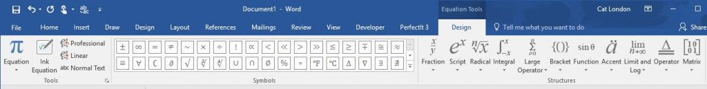
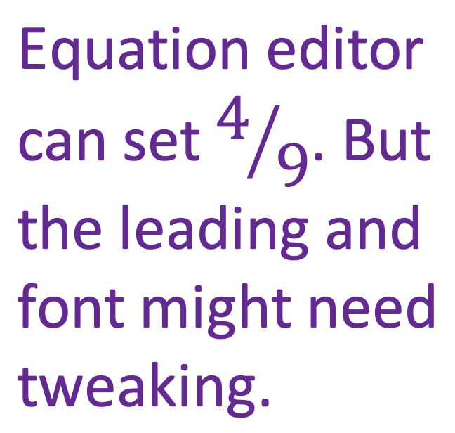
Create your own fractions in Word using the Equation icon on the Insert ribbon. Just select the stacked fraction option, then click on each box (above and below the line) to enter the numbers. This does, however, create uneven line spacing.
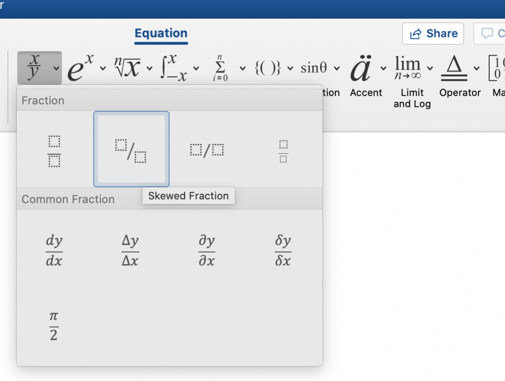
Clicking Word’s Equation icon on the Insert ribbon opens this Equation Tools/Design tab on a Windows computer. (The Mac version is simply titled Equation. Click the Fraction icon to start.
Select the type of fraction you would like to place
Once the equation blank is placed, click on each dotted box to enter a number.
To open this ribbon, click the Fraction icon on the Equations ribbon.
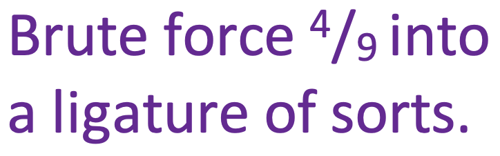
Option 3: Brute Force Equations on Your Own
If creating a special character from scratch isn’t an option (e.g., this text is being typeset for the web) then you might choose to make all fractions plain old in-line numbers separated by a solidus/slash. Or, fake it:
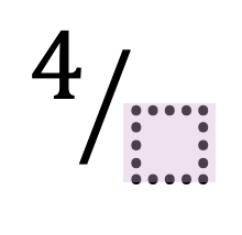
Through a combination of super- and subscript with a slash, it is possible to fake your own fraction ligature. To set a fraction so that it looks like a character, set the 4 as a superscript and the 9 as a subscript (using the icons on the Home ribbon).
Combine superscript and subscript numbers to fake a fraction symbol.
Find the super- and subscript icons on the Home ribbon to set the character placement.
The good news is that this “works” in any font, and survives changes to the font and probably can be imported into design software with minimal fuss and/or formatting loss. The bad news is, this can look really weird in some font families.
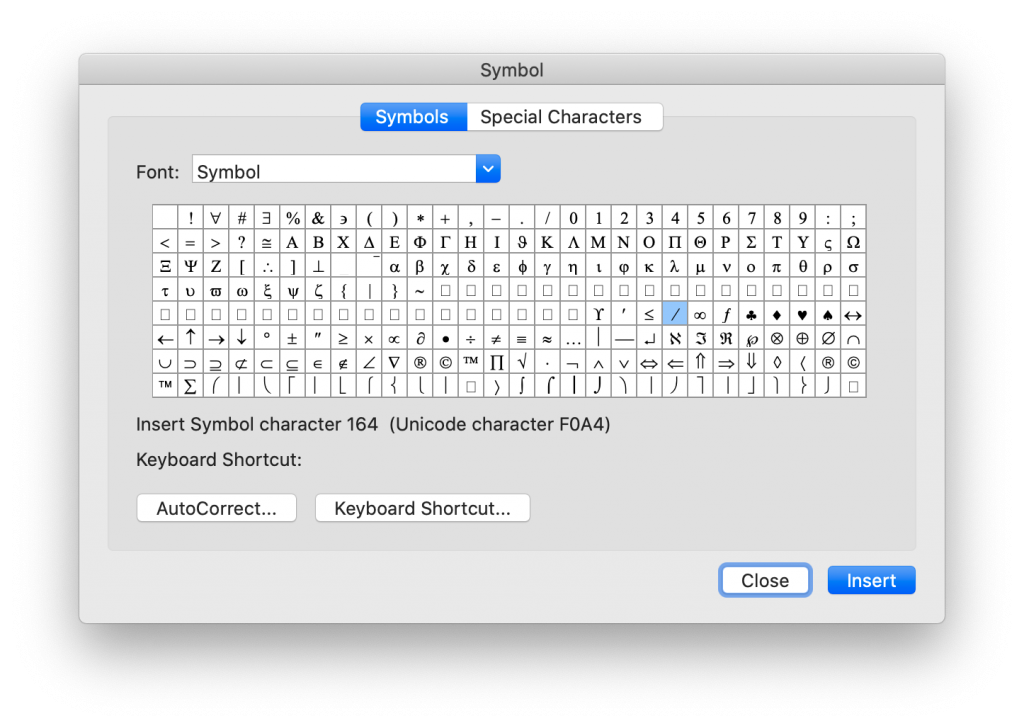
You might prefer a more slanted solidus/slash. Select that from the Advanced Symbol icon at the right edge of the Insert ribbon and insert the slash from there.
Got a gnarly Word problem? Submit your problem and we’ll try to answer it in the Q&A thread.
Remember that satisfying gear-wind and ding of shoving the carriage return back to the left of the page at the end of every line? Some writers do! But Word is not a typewriter. There should be a little pop-up confirmation box when a writer tries to hit the return key at the end of every line. And if they try to hit it twice to create double spacing, a captcha should pop-up, asking if they really want to insert two manual paragraph breaks.
Along the Home ribbon, if the window is wide enough, you can see several Styles for words and paragraphs. Unlike the font and size selections at the left edge of the ribbon, Style sets standard attributes for each kind of text: normal, body, headings, footers, and even comment balloons. And those attributes can be changed throughout a document with a single modification to the style.
Extra line spaces in a manuscript create layout problems. Whether they were used to create paragraph spacing or start a new page, manual line spacing just isn’t the best practice. What works more elegantly in the workflow is setting the paragraph spacing and using manual page breaks. But first, get rid of those extra line breaks and hard returns!
Just like the extra spaces in last week’s post, there’s no reason to be hunting and destroying extra line spaces by eye, one at a time. With a simple find and replace, MS Word can rid the file of these unwanted artifacts with just a click (or two).
Easy Steps to Rid the Manuscript of Unneeded Line Spaces
Whether it’s a holdover from the old days or someone following APA’s guide from a few years ago, every editor will eventually see a manuscript that has two spaces after every period. Because modern layout software handles sentence spacing better than typewriters did, these double spaces are no longer necessary and can, in fact, create weirdly large spacing. One of the routine things an editor (or compositor) does is strip out those double spaces. But there’s no reason to be doing this by eye, one at a time. With a simple find and replace, MS Word can rid the file of these ancient artifacts with just a click.
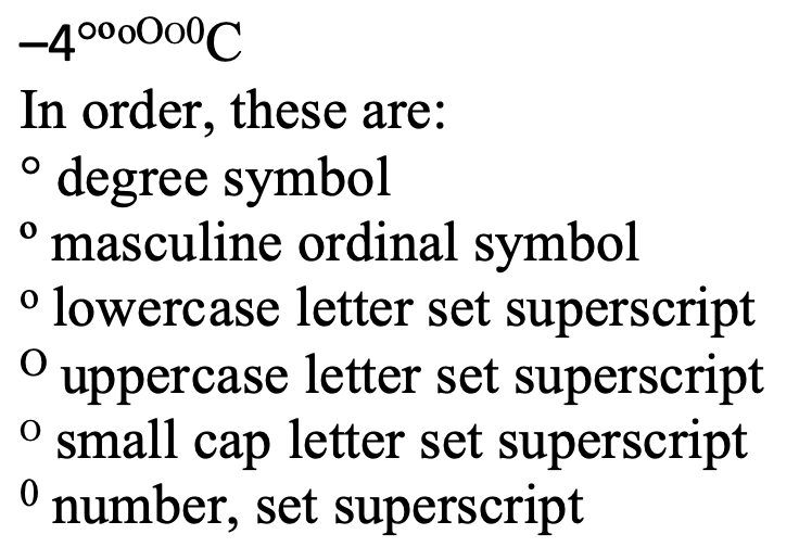
Side by side, the imposters are still not always clear.
The degree symbol is used for angles and arcs, temperatures, and the ‘proof’ of alcohol, among other things. You’ll even find it in harmonics. It started as a raised glyph of the digit 0, but best practice in typesetting and design now is to use a true degree symbol designed for the purpose.
The degree symbol is preferred because many fonts style the alternatives in ways that make them look very out of place as a degree symbol.