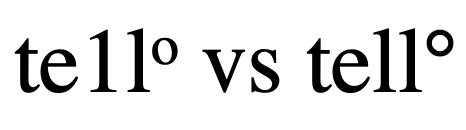
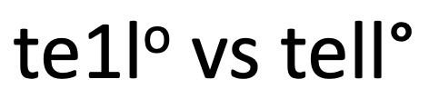
Side by side, the imposters are still not always clear.
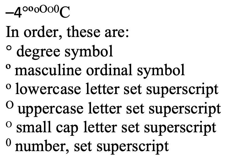
The degree symbol is used for angles and arcs, temperatures, and the ‘proof’ of alcohol, among other things. You’ll even find it in harmonics. It started as a raised glyph of the digit 0, but best practice in typesetting and design now is to use a true degree symbol designed for the purpose.
The degree symbol is preferred because many fonts style the alternatives in ways that make them look very out of place as a degree symbol.
Font geeks love to debate readability and myriad other details about fonts. The other thing that matters when editing is being able to tell when the wrong character has been used. Font choice can cleverly conceal a wrong character hiding in a document: a 1 looks like an l, a superscript o looks like a °, an ‘ masquerades as a ′…
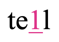
Times New Roman makes telling the difference between a 1 and an l nearly impossible. The superscript O versus the degree symbol is easier to spot; if you know what it should look like, that is.
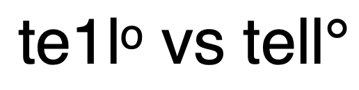
The pink character in this word is actually the digit one. There are some indicators such as spacing and height, but it’s not easy to tell at usual working magnification.
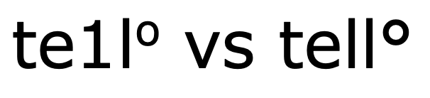
Changing the font to one that shows a more drastic difference between characters is one solution. Some editors prefer to edit in Helvetica, Calibri, or Verdana for just such a reason. If you modify the font of the “Normal” Style, it’s easy to undo this font change before finalizing the file. The client will never know the trick that helped you spot those apostrophes that should be primes. Just turn off Track Changes when you change the font.
Verdana shows clear differences between the one and ell but if you didn’t know what a degree symbol (right) looked like, it might be easy for the superscript letter O to pass itself off.