Tag Archives: best practice

Working With Tables: Converting from Plain Text

Organizing data into tables is one of the best practices in clear communication according to several pervasive style guides and according to plain language principles. Word can make tables easy to work with, even if your author has treated the screen like a typewriter and kludged a table together with tab marks and spaces.

Converting Text to Tables

If tabs and multiple spaces have been used to create a table, one of the kindest things an editor can do for a production department is convert that mess into a true table. If the stars align, that task can be as simple as this:

  1. Select the whole mess, then
  2. click the Table icon on the Insert ribbon and
  3. select Insert Table from the options.

Word will automagically convert the tab marks into table cells populated with the content you selected. It will likely be necessary to clean up the cells after this conversion to eliminate multiple space marks used to create manual indenting, etc. But it saves a lot of clicking and dragging!

Be sure to proofread your change to make sure that contents ended up in the correct cells.

Troubleshooting

Do save a reference copy of the table before you try these tricks. You will probably need it to check that the content remains arranged as intended.

If the manual table created multi-line cells with a combination of tab marks and spaces, the conversion will not be clean. You’ll still have to drag contents into their correct cells and delete superfluous non-printing marks.

Blank cells can also wreak havoc on alignment and order. Sometimes, it is just less work to create the table with brute force, dragging each cell’s contents into place one at a time. This is a great task to subcontract out if there are a lot of such tables.

a map "locator pin" styled as the MS Word logo

Check out all the other posts in this series about Working with Tables and learn all about them in the multimedia ebook self-study course!


Got a gnarly Word problem? Submit your problem and we’ll try to answer it in the Q&A thread.


Learn with us! Join a course today.

© This blog and all materials in it are copyright Adrienne Montgomerie on the date of publication. All rights reserved. No portion may be stored or distributed without express written permission. Asking is easy!

Create Uncommon Fractions

Type 1/2 in a Word document and Word with automatically change that to stacked fraction, if you haven’t changed the default autocorrect settings. But type 2/3, and nothing happens. How can you get all fractions to match? It can take some expert typesetting.

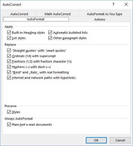
In Word’s Preferences (Mac) or Options > Proofing from the File ribbon (Windows), go to the AutoFormat tab to set whether or not fractions will be replaced with a character when one exists in that font family.

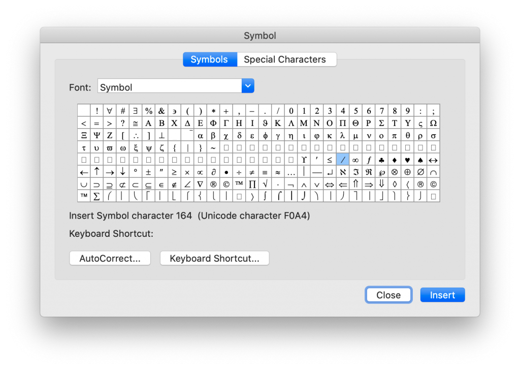
The problem is that not all fonts contain a full range of fractions, so you might not be able to insert even a common fraction like two-thirds. The character viewer in the operating system and in Word’s “insert symbol” option on the Home ribbon used to show 1/4 and 1/2 characters, but those are not appearing at the moment.

Typography experts have explained elsewhere that sometimes we just have to insert a note to the typographer in a manuscript, saying that we want a true fraction. The typographer then has to create a kind of glyph (or maybe a ligature) from scratch.

It’s weird that 2/3 isn’t built in, but odd fractions like 4/9 or 11/5 will always have to be created from scratch.

Option 1: Leave a Note to Production

Be sure to tell your compositor/typesetter in a cover letter that these fractions need to be created. Also specify whether they should be stacked with a horizontal line or a slash. In the manuscript, you might help these stand out by setting them in double [[ ]] square brackets (which is easy to search and will most likely be queried by the proofreader so they don’t make it into print).

Option 2: Create Fractions with Equation Editor

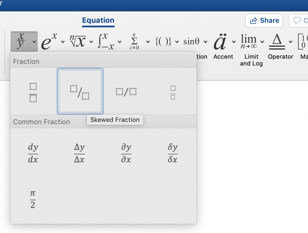
Create your own fractions in Word using the Equation icon on the Insert ribbon. Just select the stacked fraction option, then click on each box (above and below the line) to enter the numbers. This does, however, create uneven line spacing.

Clicking Word’s Equation icon on the Insert ribbon opens this Equation Tools/Design tab on a Windows computer. (The Mac version is simply titled Equation. Click the Fraction icon to start.

Option 3: Brute Force Equations on Your Own

If creating a special character from scratch isn’t an option (e.g., this text is being typeset for the web) then you might choose to make all fractions plain old in-line numbers separated by a solidus/slash. Or, fake it:

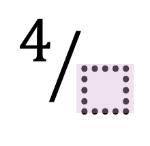
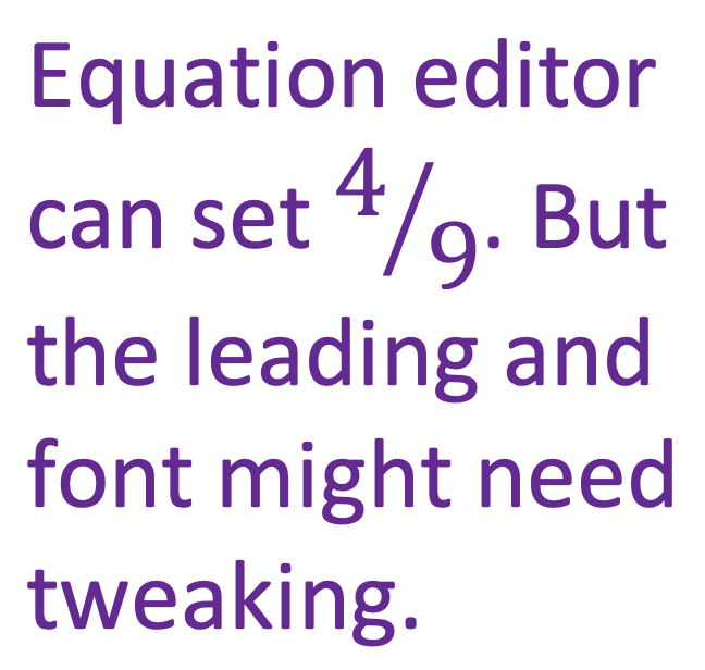
Through a combination of super- and subscript with a slash, it is possible to fake your own fraction ligature. To set a fraction so that it looks like a character, set the 4 as a superscript and the 9 as a subscript (using the icons on the Home ribbon).

The good news is that this “works” in any font, and survives changes to the font and probably can be imported into design software with minimal fuss and/or formatting loss. The bad news is, this can look really weird in some font families.


Got a gnarly Word problem? Submit your problem and we’ll try to answer it in the Q&A thread.


Learn with us! Join a course today.

© This blog and all materials in it are copyright Adrienne Montgomerie on the date of publication. All rights reserved. No portion may be stored or distributed without express written permission. Asking is easy!

Eliminate Paragraph Breaks at the End of Every Line With This Find & Replace Sequence

Remember that satisfying gear-wind and ding of shoving the carriage return back to the left of the page at the end of every line? Some writers do! But Word is not a typewriter. There should be a little pop-up confirmation box when a writer tries to hit the return key at the end of every line. And if they try to hit it twice to create double spacing, a captcha should pop-up, asking if they really want to insert two manual paragraph breaks.

Continue reading Eliminate Paragraph Breaks at the End of Every Line With This Find & Replace Sequence

Word’s Style Gallery

Along the Home ribbon, if the window is wide enough, you can see several Styles for words and paragraphs. Unlike the font and size selections at the left edge of the ribbon, Style sets standard attributes for each kind of text: normal, body, headings, footers, and even comment balloons. And those attributes can be changed throughout a document with a single modification to the style.

Continue reading Word’s Style Gallery

Fix Extra Line Spaces

pretzel shaped as a reverse P, the pilcrow paragraph mark

Extra line spaces in a manuscript create layout problems. Whether they were used to create paragraph spacing or start a new page, manual line spacing just isn’t the best practice. What works more elegantly in the workflow is setting the paragraph spacing and using manual page breaks. But first, get rid of those extra line breaks and hard returns!

Just like the extra spaces in last week’s post, there’s no reason to be hunting and destroying extra line spaces by eye, one at a time. With a simple find and replace, MS Word can rid the file of these unwanted artifacts with just a click (or two).

Easy Steps to Rid the Manuscript of Unneeded Line Spaces

Continue reading Fix Extra Line Spaces

Turn Double Spaces into Single with Just a Click

Whether it’s a holdover from the old days or someone following APA’s guide from a few years ago, every editor will eventually see a manuscript that has two spaces after every period. Because modern layout software handles sentence spacing better than typewriters did, these double spaces are no longer necessary and can, in fact, create weirdly large spacing. One of the routine things an editor (or compositor) does is strip out those double spaces. But there’s no reason to be doing this by eye, one at a time. With a simple find and replace, MS Word can rid the file of these ancient artifacts with just a click.

How to Turn Two Spaces into One

Continue reading Turn Double Spaces into Single with Just a Click

Finding Imposters: Degrees

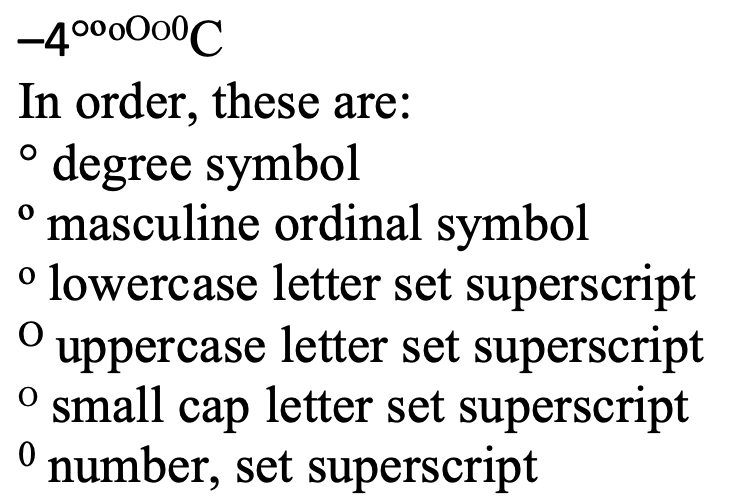
Side by side, the imposters are still not always clear.

The degree symbol is used for angles and arcs, temperatures, and the ‘proof’ of alcohol, among other things. You’ll even find it in harmonics. It started as a raised glyph of the digit 0, but best practice in typesetting and design now is to use a true degree symbol designed for the purpose.

The degree symbol is preferred because many fonts style the alternatives in ways that make them look very out of place as a degree symbol.

To Type the Degree Symbol

Continue reading Finding Imposters: Degrees

5 Uses for a Non-Breaking Space

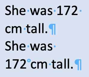
Have you ever seen the non-printing ° symbol and wondered what it was? You’re looking at a non-breaking space.
By using a non-breaking space, we can ensure that we don’t end up breaking a measurement up at the end of a line.

A non-breaking space has intentional and side benefits:

  1. Keep digits with their unit of measurement.
  2. Keep names from splitting over a line break.
  3. Keep long numbers from splitting over a line break.
  4. Identify content copied from a PDF or website.
  5. An easily searchable character for your compositor to replace.

To Find Non-Breaking Spaces

You don’t have to rely on your eyes alone. In the Find field, type ^s to search for non-breaking spaces. You can even pair this code with wildcards to quickly add non-breaking spaces between all digits and their units of measure, or in place of simple spaces in long numbers.

Compositors and others on the design team can use the non-breaking space as a placeholder for another character, often the thin space which Word cannot produce but which makes for elegant text design.

To Type a Non-Breaking Space

On a Mac: opt + spacebar

In Windows: ctrl + shift + spacebar

Troubleshooting

It’s not just plagiarism that makes an editor look for text copied from elsewhere. The non-breaking spaces in such pasted content can really mess up layout. I see these a lot in article titles in the bibliography or reference list. By changing those to regular spaces, we can save a lot of fixing in page proofs.

To show or hide these spaces and all non-printing characters, click the ¶ icon on the home ribbon.

A non-breaking space sometimes goes by the name of a fixed space or a hard space.

cover of editing in word 2016 2nd edition